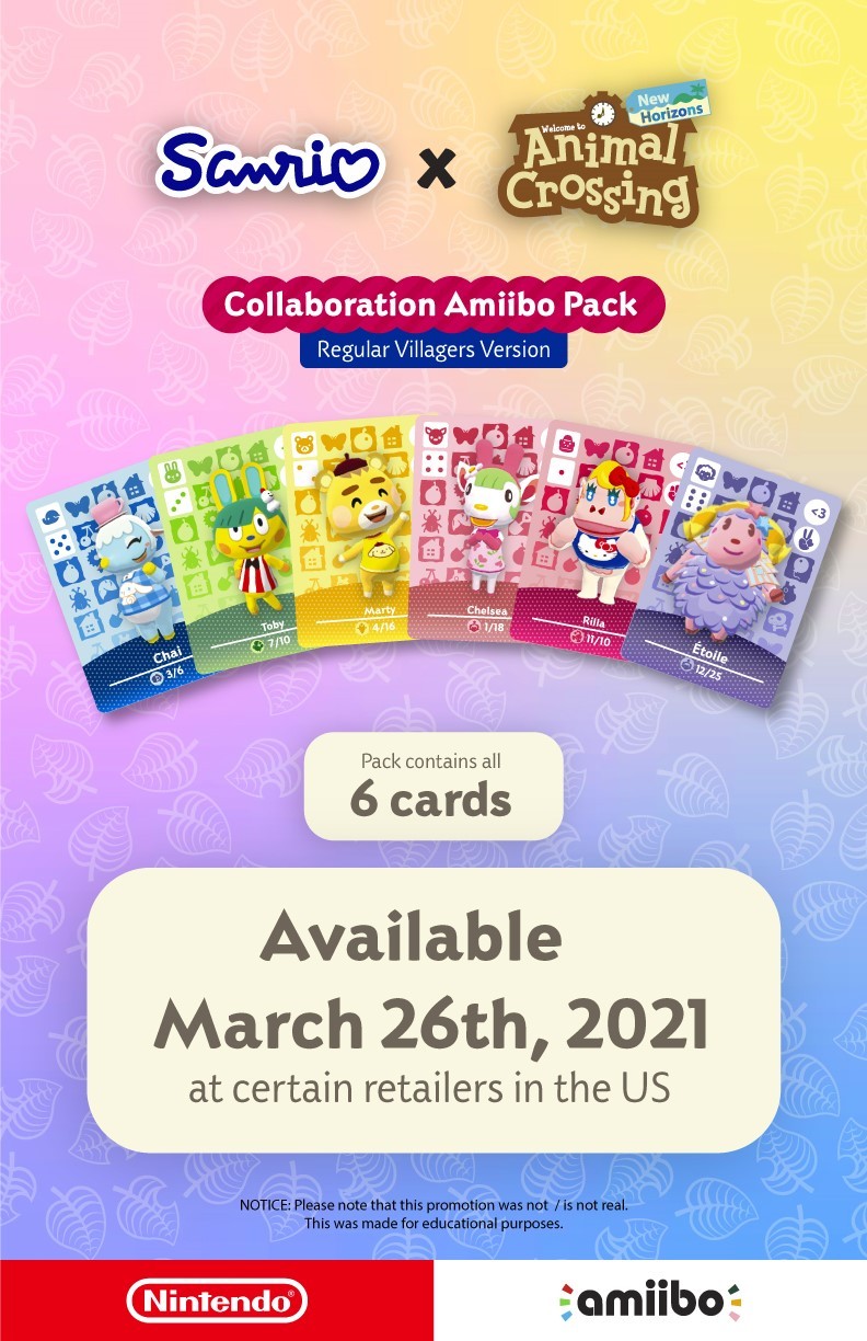
Animal Crossing

Introduction
This project involved making a poster that involved an event.
During the duration of this project, it just so happened Animal Crossing New Horizons had announced their Sanrio amiibo collaboration.
The collaboration was a limited time event in which players could find the special Sanrio amiibo cards in specific retailers. The original card designs depict the characters and the furniture & clothing items that would come with if you invited the characters on your island.
I wanted to remaster the Animal Crossing x Sanrio Amiibo collaboration cards as the regular villager cards just to see what it would’ve looked like if they were regular Animal Crossing amiibo cards.
Animal Crossing
Introduction
This project involved making a poster that involved an event.
During the duration of this project, it just so happened Animal Crossing New Horizons had announced their Sanrio amiibo collaboration.
The collaboration was a limited time event in which players could find the special Sanrio amiibo cards in specific retailers. The original card designs depict the characters and the furniture & clothing items that would come with if you invited the characters on your island.
I wanted to remaster the Animal Crossing x Sanrio Amiibo collaboration cards as the regular villager cards just to see what it would’ve looked like if they were regular Animal Crossing amiibo cards.
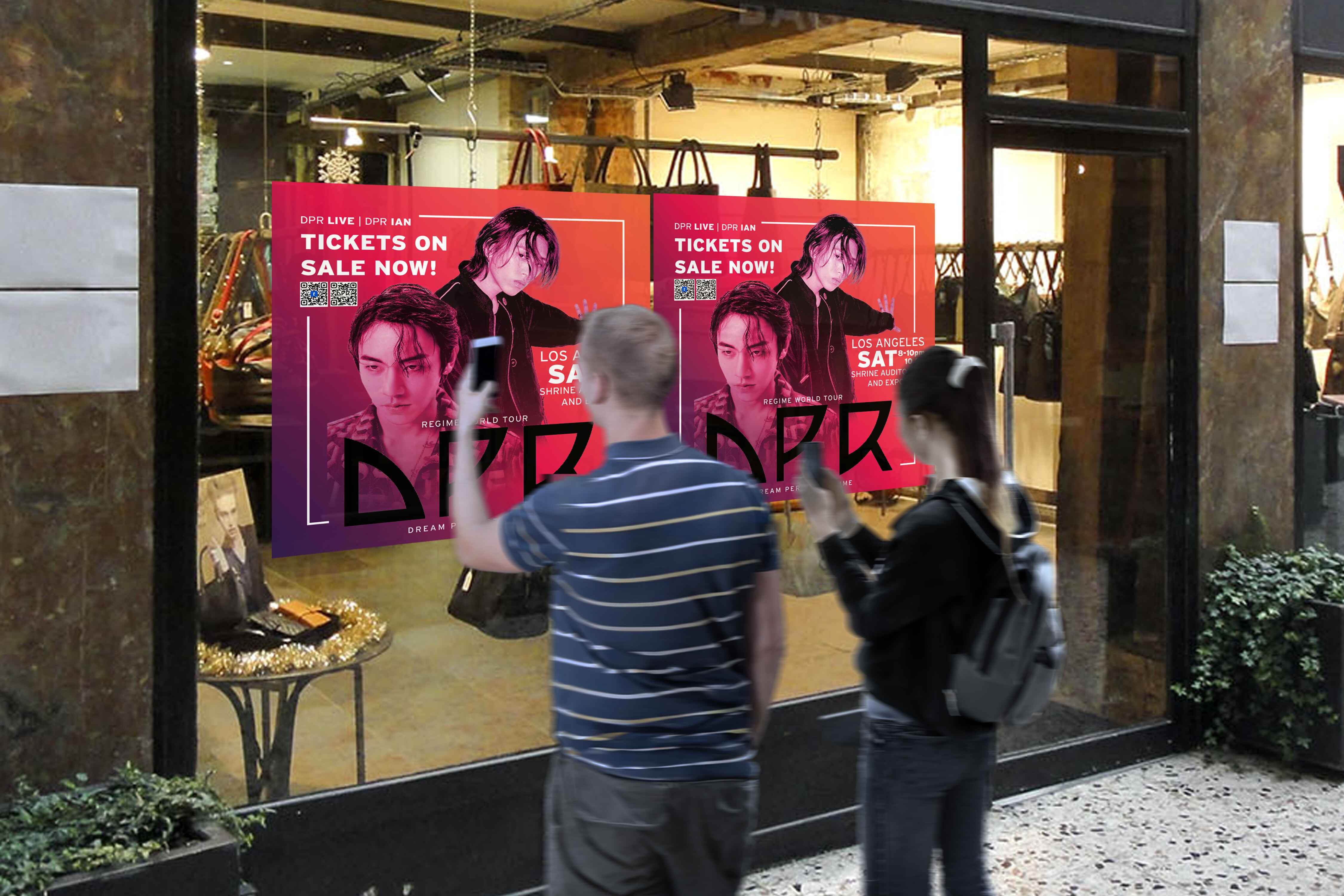
Process (Cards)


Process (Poster)


Process (Cards)
Process (Poster)
Process (Cards)
Process (Poster)
Final Look
Process (Poster)


Software & programs used:
Photoshop (to remove background from character pictures)
Illustrator (to create vector assets & poster)
Final Look
Process (Poster)
Software & programs used:
Photoshop (to remove background from character pictures)
Illustrator (to create vector assets & poster)
Process (Poster)
Colors
The convention's visual identity uses consistent purple and green colors.
Torn paper & Tape
I replicated their social media and website motifs.
Typeface
I used the convention's typeface, Interstate, for consistency and legibility.
Colors
The convention's visual identity is characterized by the consistent use of purple and green throughout their social media accounts and the signage in the venue itself.
Torn paper & Tape
These motifs were prevalent across their social media platforms and website. It’d only be natural to adapt it into all media forms. I did my best replicating it into this brochure.
Typeface
I aimed to maintain consistency by utilizing the same typeface featured in the convention's visual identity. I ended up with using Interstate due to its legibility & how it offers a versatile range of styles.
Colors
The convention's visual identity uses consistent purple and green colors.
Torn paper & Tape
I replicated their social media and website motifs.
Typeface
I used the convention's typeface, Interstate, for consistency and legibility.
Final Look
Software & programs used:
Photoshop (to remove background from character pictures)
Illustrator (to create vector assets & poster)
Final Look
Software & programs used:
Photoshop (to remove background from character pictures)
Illustrator (to create vector assets & poster)