


Colors
The convention's visual identity uses consistent purple and green colors.
Torn paper & Tape
I replicated their social media and website motifs.
Typeface
I used the convention's typeface, Interstate, for consistency and legibility.
Colors
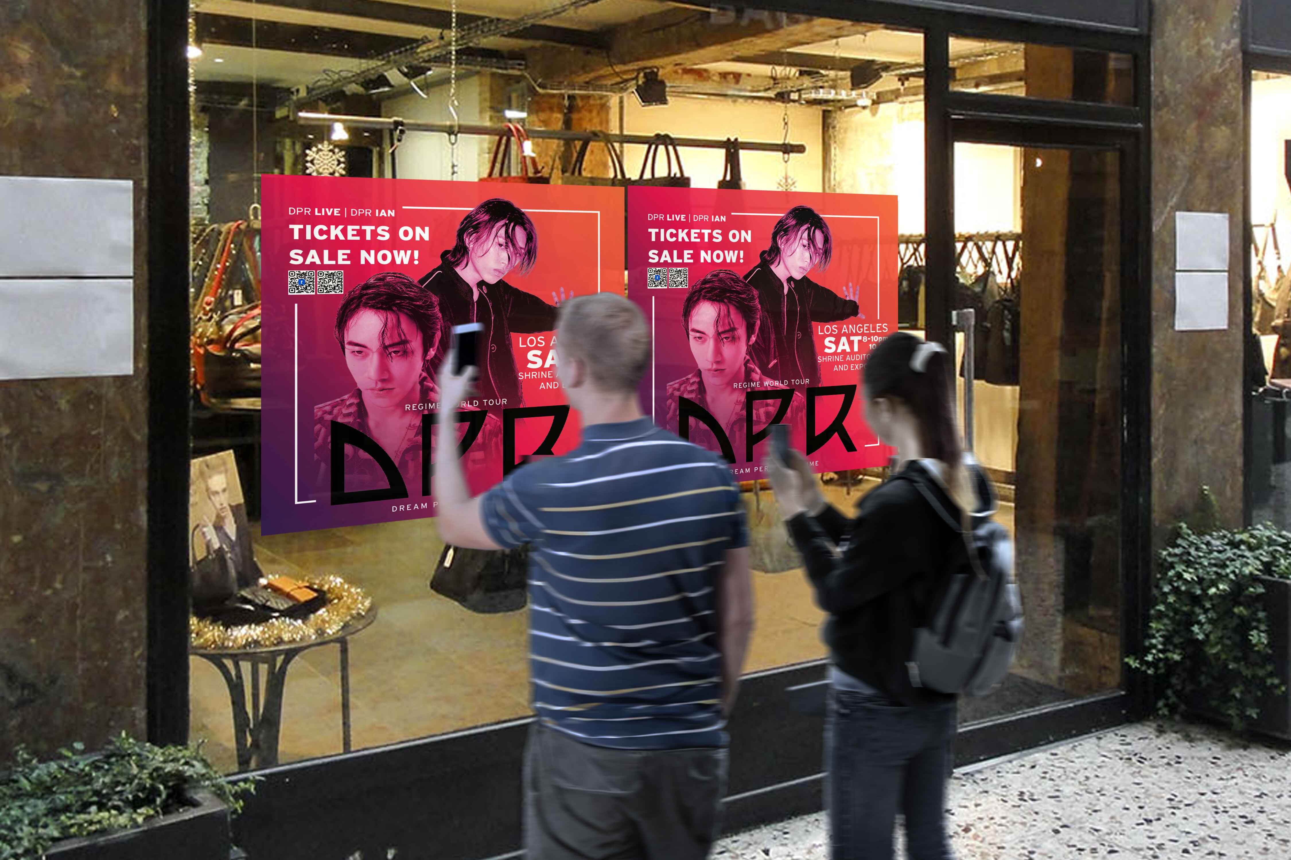
The convention's visual identity is characterized by the consistent use of purple and green throughout their social media accounts and the signage in the venue itself.
Torn paper & Tape
These motifs were prevalent across their social media platforms and website. It’d only be natural to adapt it into all media forms. I did my best replicating it into this brochure.
Typeface
I aimed to maintain consistency by utilizing the same typeface featured in the convention's visual identity. I ended up with using Interstate due to its legibility & how it offers a versatile range of styles.
Colors
The convention's visual identity uses consistent purple and green colors.
Torn paper & Tape
I replicated their social media and website motifs.
Typeface
I used the convention's typeface, Interstate, for consistency and legibility.
Colors
The convention's visual identity is characterized by the consistent use of purple and green throughout their social media accounts and the signage in the venue itself.
Torn paper & Tape
These motifs were prevalent across their social media platforms and website. It’d only be natural to adapt it into all media forms. I did my best replicating it into this brochure.
Typeface
I aimed to maintain consistency by utilizing the same typeface featured in the convention's visual identity. I ended up with using Interstate due to its legibility & how it offers a versatile range of styles.
Colors
The convention's visual identity uses consistent purple and green colors.
Torn paper & Tape
I replicated their social media and website motifs.
Typeface
I used the convention's typeface, Interstate, for consistency and legibility.