Seoul PopCon

Introduction
This project involved the creation of various materials for the Seoul Pop Culture Convention. These materials include:
A Multi-page program brochure,
a table-tent card,
conference badges, and
a sign-up teaser advertisement.
The collateral items were crafted with the perspective that they were intended for an authentic convention in Seoul, Korea, while the brochure was designed for an international audience. A key objective of this project was to develop a suite of deliverables that align with the visual identity of the convention.
Each item has its own purpose.
With a focus on user experience, my aim was to ensure that the deliverables were not only informative but also practical, enhancing the overall convention-going experience.

Brochure → Has all the info & provides a portable alternative.
Table Tent Card→ identify the event details & the specifics.


Badges → Identification for all the guests & includes a map of the venue.
Teaser Ad →Inform everyone about next year's convention & urge them to sign up soon.
The multipage brochure introduces the Seoul Pop Culture Convention, vendor hall hours, panel schedules, guests, FAQ, and sponsor thanks. QR codes link to the SeoulPopCon website for more info. Without the local Korean brochure, I aimed to capture the event's essence for international attendees.
Seoul PopCon
Introduction
This project involved the creation of various materials for the Seoul Pop Culture Convention. These materials include:
A Multi-page program brochure,
a table-tent card,
conference badges, and
a sign-up teaser advertisement.
The collateral items were crafted with the perspective that they were intended for an authentic convention in Seoul, Korea, while the brochure was designed for an international audience. A key objective of this project was to develop a suite of deliverables that align with the visual identity of the convention.
Each item has its own purpose.
With a focus on user experience, my aim was to ensure that the deliverables were not only informative but also practical, enhancing the overall convention-going experience.
Brochure → Has all the info & provides a portable alternative.
Table Tent Card→ identify the event details & the specifics.
Badges → Identification for all the guests & includes a map of the venue.
Teaser Ad →Inform everyone about next year's convention & urge them to sign up soon.
With a focus on user experience, my aim was to ensure that the deliverables were not only informative but also practical, enhancing the overall convention-going experience.
Seoul PopCon
Introduction
This project involved the creation of various materials for the Seoul Pop Culture Convention. These materials include:
A Multi-page program brochure,
a table-tent card,
conference badges, and
a sign-up teaser advertisement.
The collateral items were crafted with the perspective that they were intended for an authentic convention in Seoul, Korea, while the brochure was designed for an international audience. A key objective of this project was to develop a suite of deliverables that align with the visual identity of the convention.
Each item has its own purpose.
With a focus on user experience, my aim was to ensure that the deliverables were not only informative but also practical, enhancing the overall convention-going experience.
Brochure → Has all the info & provides a portable alternative.
Table Tent Card→ identify the event details & the specifics.
Badges → Identification for all the guests & includes a map of the venue.
Teaser Ad →Inform everyone about next year's convention & urge them to register.
The multipage brochure introduces the Seoul Pop Culture Convention, vendor hall hours, panel schedules, guests, FAQ, and sponsor thanks. QR codes link to the SeoulPopCon website for more info. Without the local Korean brochure, I aimed to capture the event's essence for international attendees.
How does each item serve its purpose?

The multipage brochure introduces the Seoul Pop Culture Convention, vendor hall hours, panel schedules, guests, FAQ, and sponsor thanks. QR codes link to the SeoulPopCon website for more info. Without the local Korean brochure, I aimed to capture the event's essence for international attendees.

The Table Tent Card features visuals from "Solo Leveling" and its animated adaptation, with event details on the back, consistent with the convention's visual identity. It honors the late artist and commemorates the animation announcement, appealing to fans worldwide.
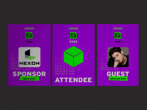
The Convention Badges, featuring bright purple for visibility, were designed to help admissions and security identify attendees. They also distinguish honored guests with large labels and company logos. The back includes a venue map and QR codes for quick access to information.

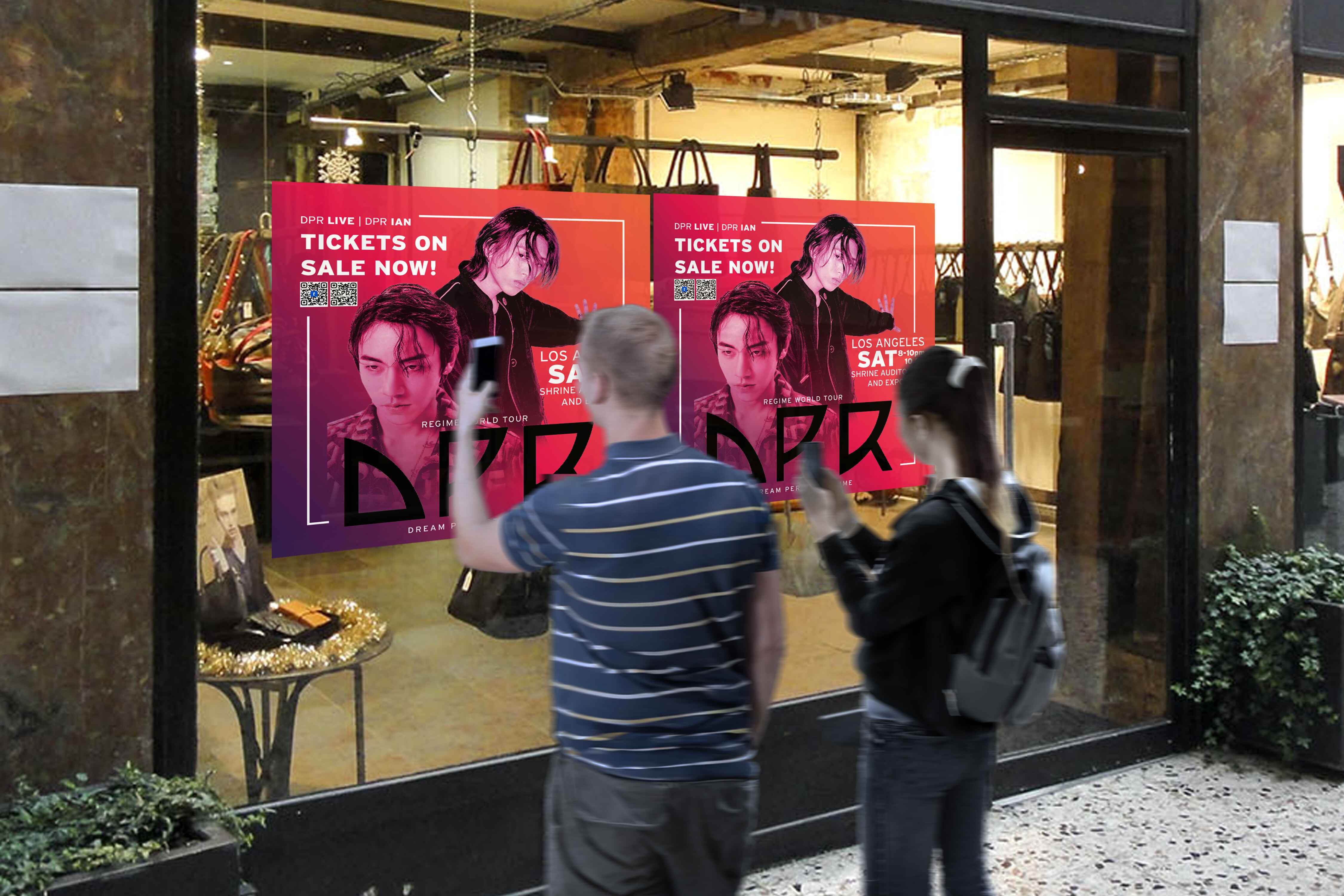
The Teaser Advertisement uses bold text and traditional ripped paper elements to grab attention, featuring the convention's green and purple colors. Incorporating the motto "For the fans, by the fans," the torn paper design suggests viewers can "unwrap" the ad to reveal the fan-focused spirit of the convention.
How does each item serve its purpose?
The multipage brochure introduces the Seoul Pop Culture Convention, vendor hall hours, panel schedules, guests, FAQ, and sponsor thanks. QR codes link to the SeoulPopCon website for more info. Without the local Korean brochure, I aimed to capture the event's essence for international attendees.
The Table Tent Card features visuals from "Solo Leveling" and its animated adaptation, with event details on the back, consistent with the convention's visual identity. It honors the late artist and commemorates the animation announcement, appealing to fans worldwide.
The Convention Badges, featuring bright purple for visibility, were designed to help admissions and security identify attendees. They also distinguish honored guests with large labels and company logos. The back includes a venue map and QR codes for quick access to information.
The Teaser Advertisement uses bold text and traditional ripped paper elements to grab attention, featuring the convention's green and purple colors. Incorporating the motto "For the fans, by the fans," the torn paper design suggests viewers can "unwrap" the ad to reveal the fan-focused spirit of the convention.
Additional notes for this project
Why certain elements?

Another objective of this project was to create a multifaceted identity for the convention and seamlessly translate the digital experience onto printed media. This approach ensures the experience from onboarding online to attending in-person would be seamless.

The Teaser Advertisement was designed to be both simple and attention-grabbing, achieved through the juxtaposition of modern bold text against traditional ripped paper elements.
Drawing from the convention's visual identity, which features contrasting colors like green and purple, I utilized both hues along with the concept of torn paper and bold typography.
The convention also has a motto of “For the fans, by the fans” and I wanted to incorporate that as well. Additionally, considering the convention's motto of "For the fans, by the fans," I integrated this phrase into the background of the advertisement.
By incorporating torn paper elements, I wanted to create the impression that viewers could simply "unwrap" to discover that the convention embodies the idea of being truly "for the fans, by the fans.”
The Convention Badges were designed to be obvious & highly visible so that admissions or security could have an easier time identifying the attendees. Using the convention’s bright purple in the visual identity was the perfect situation to boost visibility and recognition.
Alongside the prominent purple color, the badges were also designed to distinguish honored guests and hosts from other attendees.
To achieve this, each badge prominently displays a large, bold label on the front, clearly identifying the wearer's status. Additionally, special guests are easily recognizable by the inclusion of their company's name and logo on their badge. • In terms of functionality, the backside of the badges have a picture of the venue map and a set of QR codes, offering instant access to information when needed.
The Table Tent Card features visuals from "Solo Leveling" and its animated adaptation, with event details on the back, consistent with the convention's visual identity. It honors the late artist and commemorates the animation announcement, appealing to fans worldwide.


The Table Tent Card features visuals from "Solo Leveling" and its animated adaptation, with event details on the back, consistent with the convention's visual identity. It honors the late artist and commemorates the animation announcement, appealing to fans worldwide.
Another objective of this project was to create a multifaceted identity for the convention and seamlessly translate the digital experience onto printed media. This approach ensures the experience from onboarding online to attending in-person would be seamless.
Softwares used:
Adobe InDesign (for layout & formatting)
Adobe Illustrator (to create the finer design elements)
Additional notes for this project
Why certain elements?
Another objective of this project was to create a multifaceted identity for the convention and seamlessly translate the digital experience onto printed media. This approach ensures the experience from onboarding online to attending in-person would be seamless.
The Teaser Advertisement was designed to be both simple and attention-grabbing, achieved through the juxtaposition of modern bold text against traditional ripped paper elements.
Drawing from the convention's visual identity, which features contrasting colors like green and purple, I utilized both hues along with the concept of torn paper and bold typography.
The convention also has a motto of “For the fans, by the fans” and I wanted to incorporate that as well. Additionally, considering the convention's motto of "For the fans, by the fans," I integrated this phrase into the background of the advertisement.
By incorporating torn paper elements, I wanted to create the impression that viewers could simply "unwrap" to discover that the convention embodies the idea of being truly "for the fans, by the fans.”
The Convention Badges were designed to be obvious & highly visible so that admissions or security could have an easier time identifying the attendees. Using the convention’s bright purple in the visual identity was the perfect situation to boost visibility and recognition.
Alongside the prominent purple color, the badges were also designed to distinguish honored guests and hosts from other attendees.
To achieve this, each badge prominently displays a large, bold label on the front, clearly identifying the wearer's status. Additionally, special guests are easily recognizable by the inclusion of their company's name and logo on their badge. • In terms of functionality, the backside of the badges have a picture of the venue map and a set of QR codes, offering instant access to information when needed.
Another objective of this project was to create a multifaceted identity for the convention and seamlessly translate the digital experience onto printed media. This approach ensures the experience from onboarding online to attending in-person would be seamless.
Another objective of this project was to create a multifaceted identity for the convention and seamlessly translate the digital experience onto printed media. This approach ensures the experience from onboarding online to attending in-person would be seamless.
Softwares used:
Adobe InDesign (for layout & formatting)
Adobe Illustrator (to create the finer design elements)
How does each item serve its purpose?
The multipage brochure effectively fulfills its purpose by offering comprehensive information. The initial pages introduce the rich history of the Seoul Pop Culture Convention.
Following this, you'll find a table of contents and details such as vendor hall hours, panel schedules, distinguished guests, an FAQ section, and a page dedicated to thanking potential sponsors.
My intention was for this brochure to convey the essence of the actual event. While I didn’t have access to the convention’s local Korean brochure, I did my best to express how the convention’s brochure would’ve looked like for international attendees.
Additionally, the strategically placed QR codes throughout the brochure offer a smooth digital experience, directing users to relevant pages on the SeoulPopCon website for further insights related to each section.
The Table Tent Card serves its role of identifying an ongoing event by through a captivating visual presentation. It features the popular webtoon series "Solo Leveling," alongside a teaser image of its animated adaptation, drawing attention to the attendees.
The event details, including date and time, are conveniently located on the backside of the Table Tent Card, maintaining consistency with the visual identity observed throughout the convention.
At the time, the Solo Leveling webtoon’s popularity was sky high. The news of its upcoming animated adaptation, just following the passing of the webtoon's main artist, became a trending topic not only among Korean fans but also among international audiences.
As a personal touch to this project, I aimed to pay a modest tribute to the webtoon's artist and commemorate the announcement of the green-lit animation.
The Convention Badges were designed to be obvious & highly visible so that admissions or security could have an easier time identifying the attendees. Using the convention’s bright purple in the visual identity was the perfect situation to boost visibility and recognition.
Alongside the prominent purple color, the badges were also designed to distinguish honored guests and hosts from other attendees.
To achieve this, each badge prominently displays a large, bold label on the front, clearly identifying the wearer's status. Additionally, special guests are easily recognizable by the inclusion of their company's name and logo on their badge. • In terms of functionality, the backside of the badges have a picture of the venue map and a set of QR codes, offering instant access to information when needed.
The Teaser Advertisement was designed to be both simple and attention-grabbing, achieved through the juxtaposition of modern bold text against traditional ripped paper elements.
• Drawing from the convention's visual identity, which features contrasting colors like green and purple, I utilized both hues along with the concept of torn paper and bold typography.
The convention also has a motto of “For the fans, by the fans” and I wanted to incorporate that as well. Additionally, considering the convention's motto of "For the fans, by the fans," I integrated this phrase into the background of the advertisement.
By incorporating torn paper elements, I wanted to create the impression that viewers could simply "unwrap" to discover that the convention embodies the idea of being truly "for the fans, by the fans.”
All of these steps were taken with an active effort to make the deliverables as useful & informative as possible.
How does each item serve its purpose?
The multipage brochure effectively fulfills its purpose by offering comprehensive information. The initial pages introduce the rich history of the Seoul Pop Culture Convention.
Following this, you'll find a table of contents and details such as vendor hall hours, panel schedules, distinguished guests, an FAQ section, and a page dedicated to thanking potential sponsors.
My intention was for this brochure to convey the essence of the actual event. While I didn’t have access to the convention’s local Korean brochure, I did my best to express how the convention’s brochure would’ve looked like for international attendees.
Additionally, the strategically placed QR codes throughout the brochure offer a smooth digital experience, directing users to relevant pages on the SeoulPopCon website for further insights related to each section.
The Table Tent Card serves its role of identifying an ongoing event by through a captivating visual presentation. It features the popular webtoon series "Solo Leveling," alongside a teaser image of its animated adaptation, drawing attention to the attendees.
The event details, including date and time, are conveniently located on the backside of the Table Tent Card, maintaining consistency with the visual identity observed throughout the convention.
At the time, the Solo Leveling webtoon’s popularity was sky high. The news of its upcoming animated adaptation, just following the passing of the webtoon's main artist, became a trending topic not only among Korean fans but also among international audiences.
The Convention Badges were designed to be obvious & highly visible so that admissions or security could have an easier time identifying the attendees. Using the convention’s bright purple in the visual identity was the perfect situation to boost visibility and recognition.
Alongside the prominent purple color, the badges were also designed to distinguish honored guests and hosts from other attendees.
To achieve this, each badge prominently displays a large, bold label on the front, clearly identifying the wearer's status. Additionally, special guests are easily recognizable by the inclusion of their company's name and logo on their badge.
In terms of functionality, the backside of the badges have a picture of the venue map and a set of QR codes, offering instant access to information when needed.
The Teaser Advertisement was designed to be both simple and attention-grabbing, achieved through the juxtaposition of modern bold text against traditional ripped paper elements.
• Drawing from the convention's visual identity, which features contrasting colors like green and purple, I utilized both hues along with the concept of torn paper and bold typography.
The convention also has a motto of “For the fans, by the fans” and I wanted to incorporate that as well. Additionally, considering the convention's motto of "For the fans, by the fans," I integrated this phrase into the background of the advertisement.
By incorporating torn paper elements, I wanted to create the impression that viewers could simply "unwrap" to discover that the convention embodies the idea of being truly "for the fans, by the fans.”
All of these steps were taken with an active effort to make the deliverables as useful & informative as possible.
Why certain elements?

Colors
The convention's visual identity uses consistent purple and green colors.

Torn paper & Tape
I replicated their social media and website motifs.

Typeface
I used the convention's typeface, Interstate, for consistency and legibility.
Colors
The convention's visual identity is characterized by the consistent use of purple and green throughout their social media accounts and the signage in the venue itself.
Torn paper & Tape
These motifs were prevalent across their social media platforms and website. It’d only be natural to adapt it into all media forms. I did my best replicating it into this brochure.
Typeface
I aimed to maintain consistency by utilizing the same typeface featured in the convention's visual identity. I ended up with using Interstate due to its legibility & how it offers a versatile range of styles.
Why certain elements?
Colors
The convention's visual identity uses consistent purple and green colors.
Torn paper & Tape
I replicated their social media and website motifs.
Typeface
I used the convention's typeface, Interstate, for consistency and legibility.
Colors
The convention's visual identity is characterized by the consistent use of purple and green throughout their social media accounts and the signage in the venue itself.
Torn paper & Tape
These motifs were prevalent across their social media platforms and website. It’d only be natural to adapt it into all media forms. I did my best replicating it into this brochure.
Typeface
I aimed to maintain consistency by utilizing the same typeface featured in the convention's visual identity. I ended up with using Interstate due to its legibility & how it offers a versatile range of styles.
Colors
The convention's visual identity uses consistent purple and green colors.
Torn paper & Tape
I replicated their social media and website motifs.
Typeface
I used the convention's typeface, Interstate, for consistency and legibility.
Additional notes for this project
Another objective of this project was to create a multifaceted identity for the convention and seamlessly translate the digital experience onto printed media. This approach ensures the experience from onboarding online to attending in-person would be seamless.
Softwares used:
Adobe InDesign (for layout & formatting)
Adobe Illustrator (to create the finer design elements)
Additional notes for this project
Another objective of this project was to create a multifaceted identity for the convention and seamlessly translate the digital experience onto printed media. This approach ensures the experience from onboarding online to attending in-person would be seamless.
Another objective of this project was to create a multifaceted identity for the convention and seamlessly translate the digital experience onto printed media. This approach ensures the experience from onboarding online to attending in-person would be seamless.
Softwares used:
Adobe InDesign (for layout & formatting)
Adobe Illustrator (to create the finer design elements)